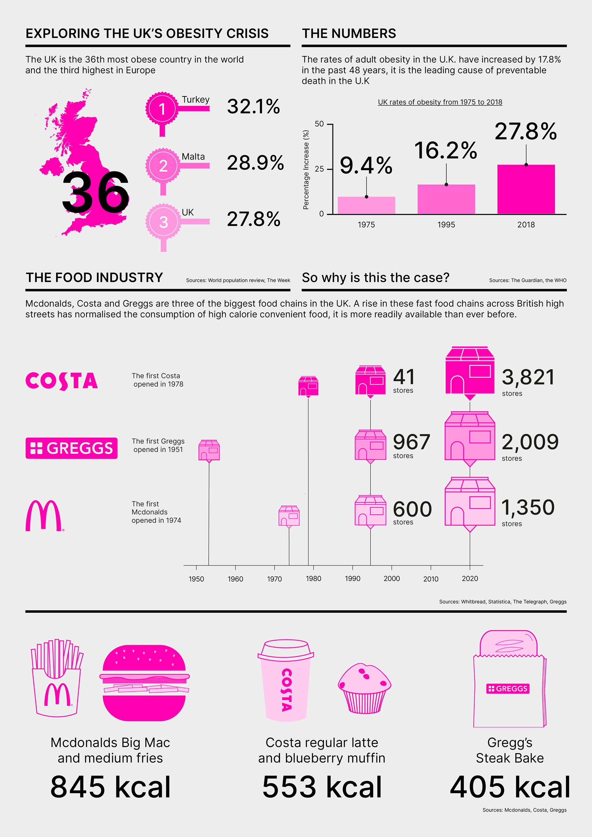
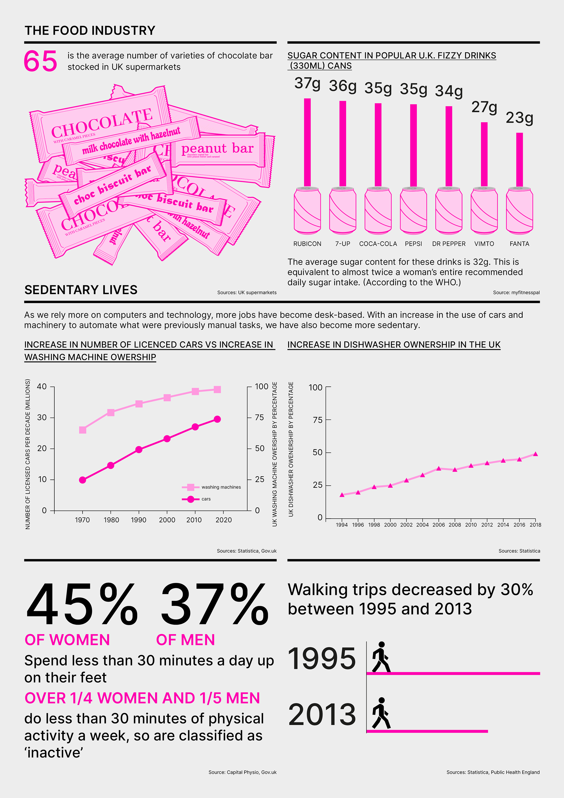
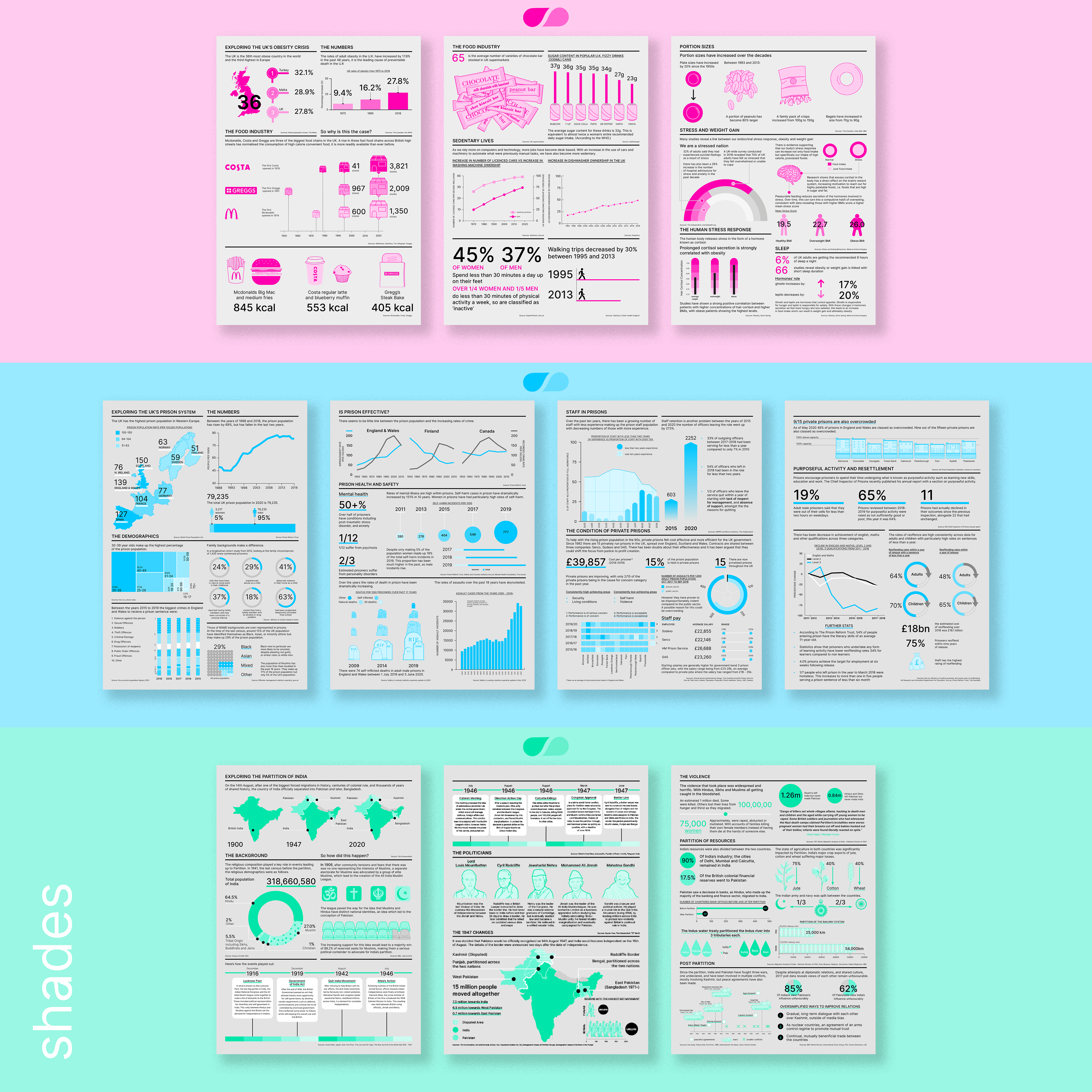
Shades is a data vis project looking at the ways in which data can be used to tell a story, explain a process and simplify a multi-layered topic. It was a way to combine my love of branding with my passion for finding interesting ways to present data. I wanted to play with a style that supports the presenting of complex information but also feels a bit more restrained aesthetically than standard infographics.
Each topic is a topic I wanted to learn more about, but I have tried to design it in a way that others may be able to learn from it too. An approach designed to appeal to those that love new information but also appreciate interesting design.
It is a modern, clean, style, uses a strict grid system, spacing rules and I've assigned shades of one colour to each series, hence the name. Shades of each colour also felt like a good visual translation to depict the nuances of each issue. This kept the palette restrained but pushed me creatively to distinguish data in ways other than different colours.The name also felt obvious and simple, in keeping with the style. I designed a logo for the whole visual concept, tweaking the shape inside the letter ‘a’, to make a droplet shape, to suggest a drop of ink - a reference to the name.
In summary, I've designed an identity that supports information design, with guidelines and collateral, and shown how to use that identity to present three stories.
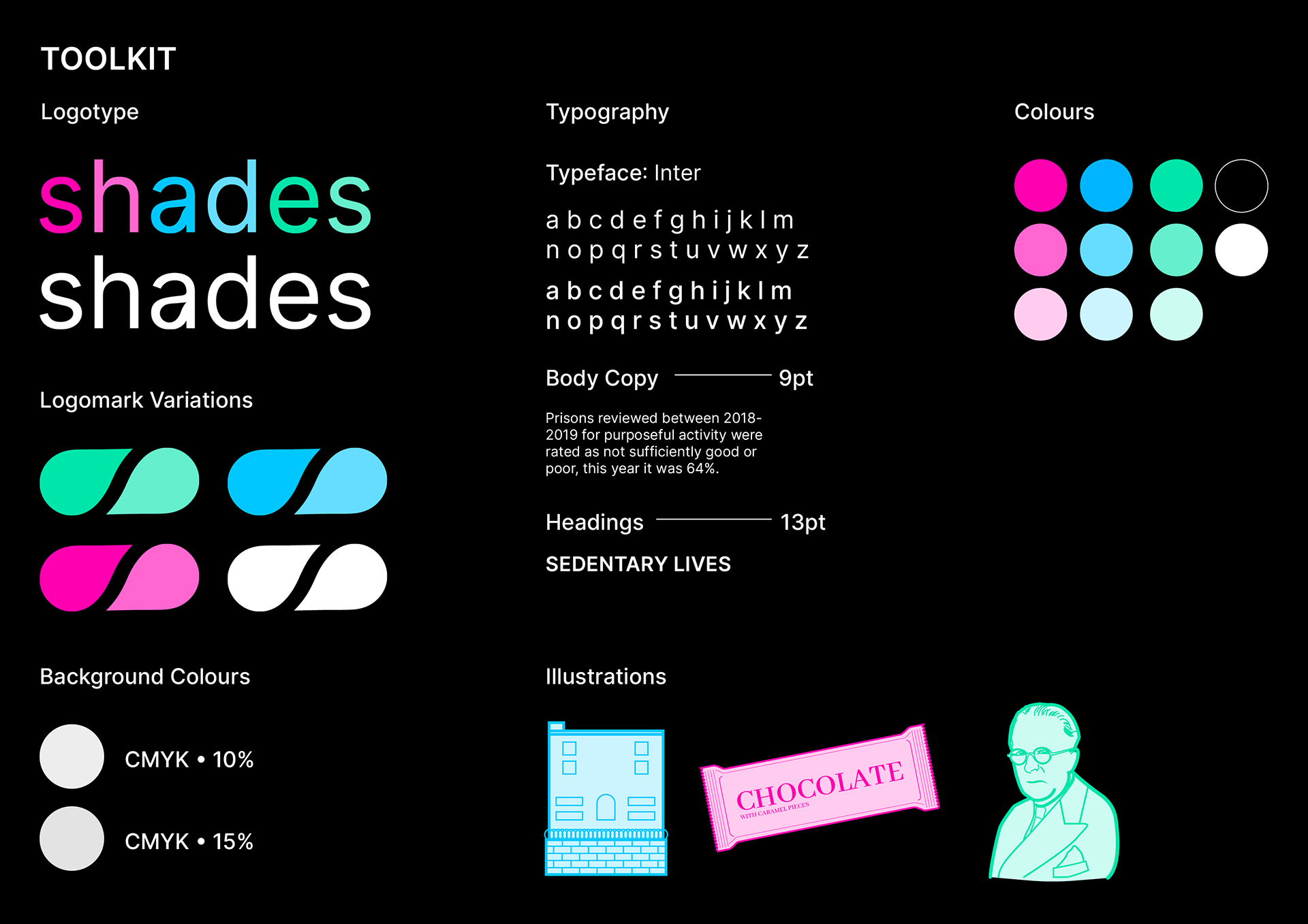
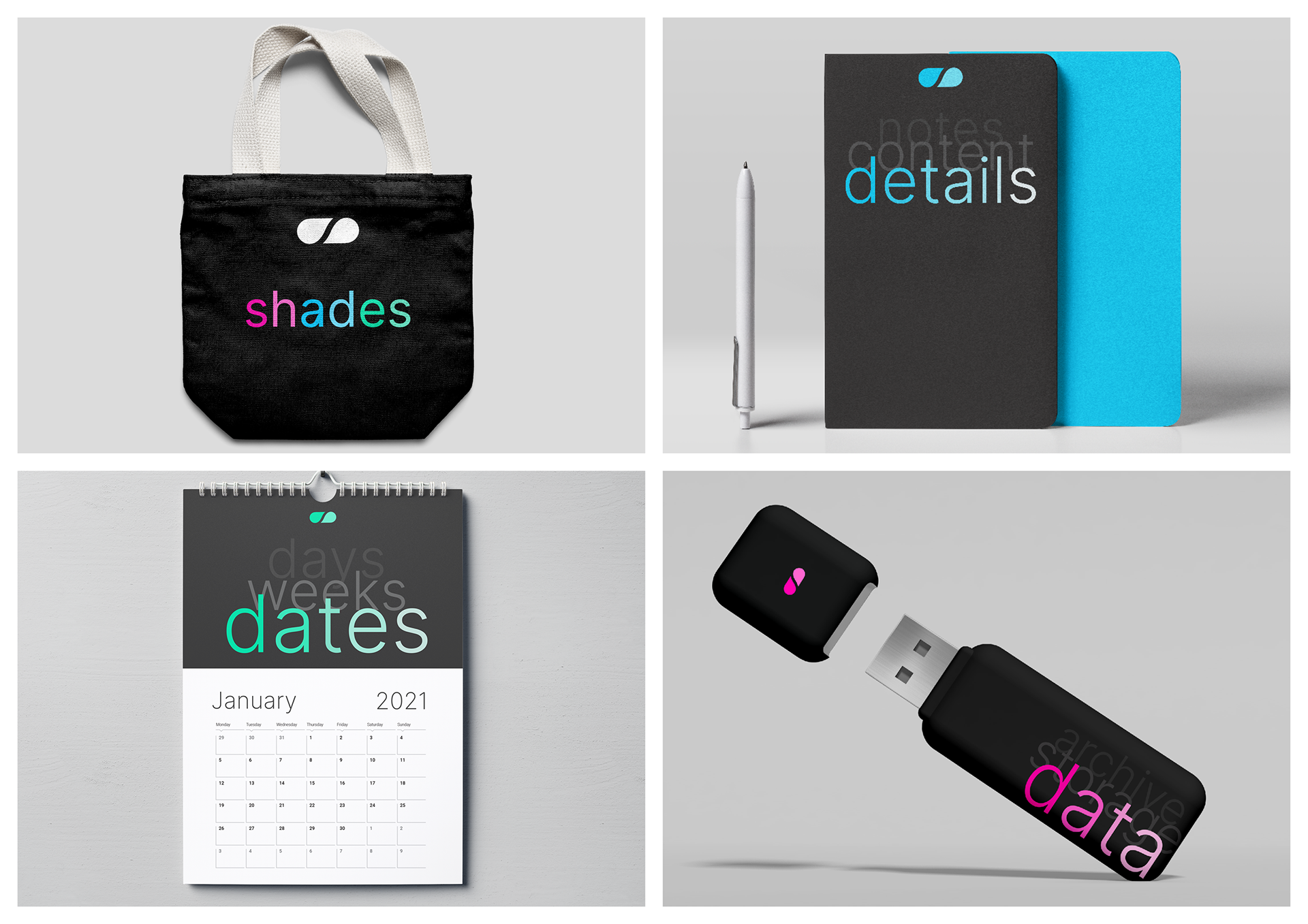
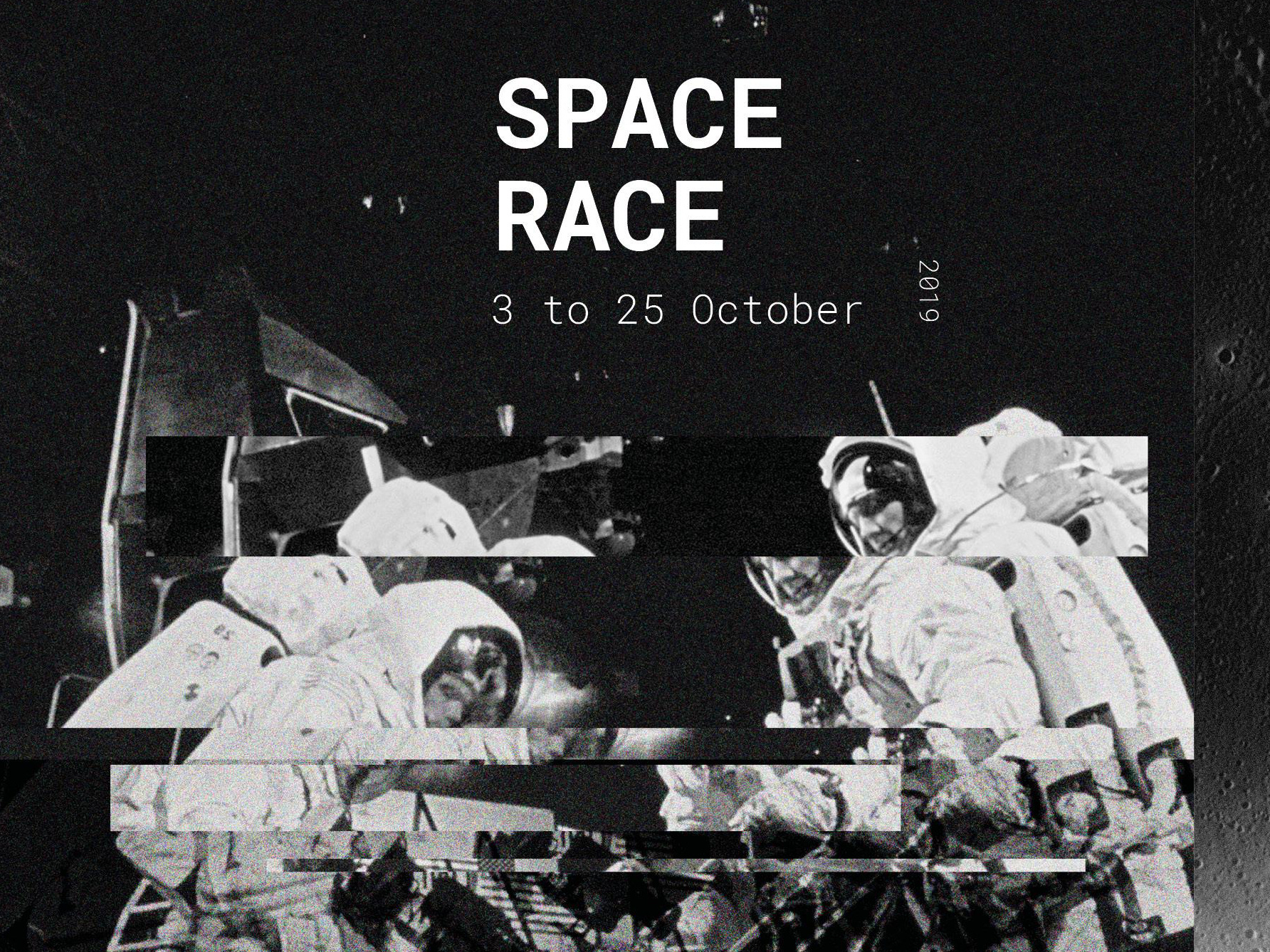
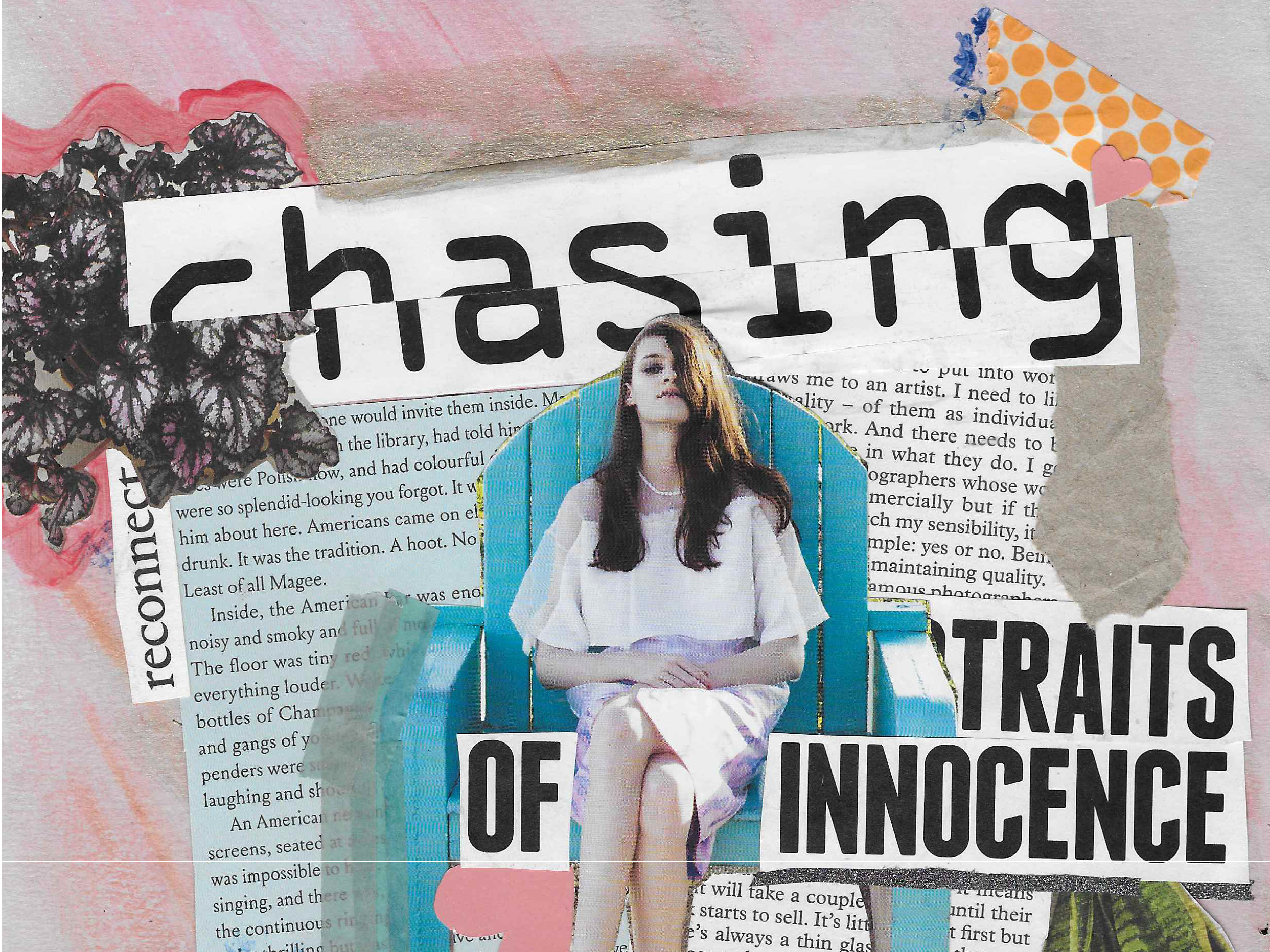
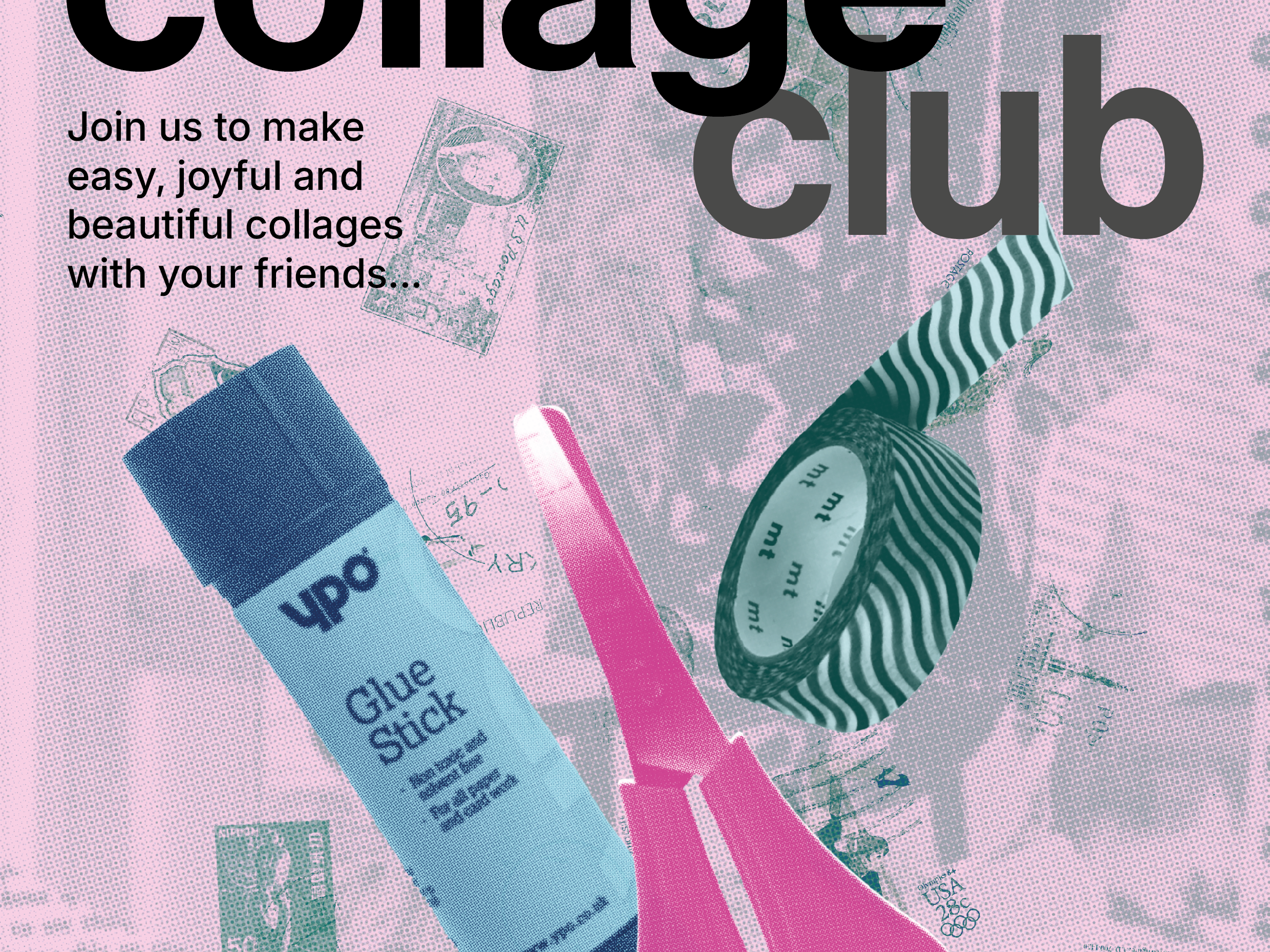
Some collateral branded stuff to expand out the visual concept.