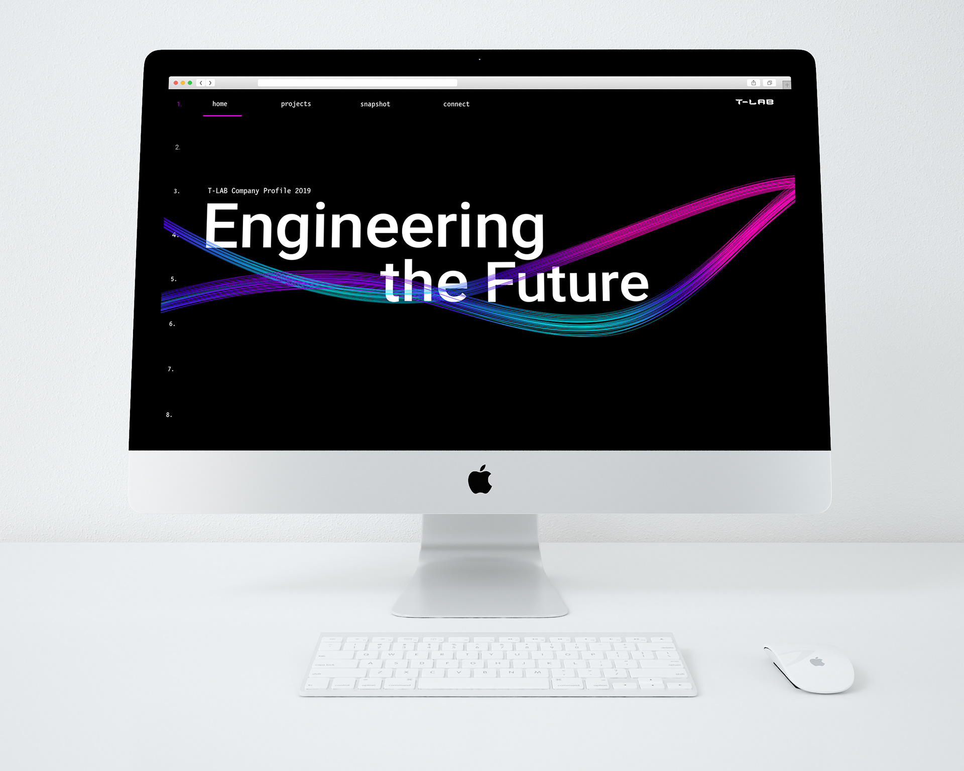
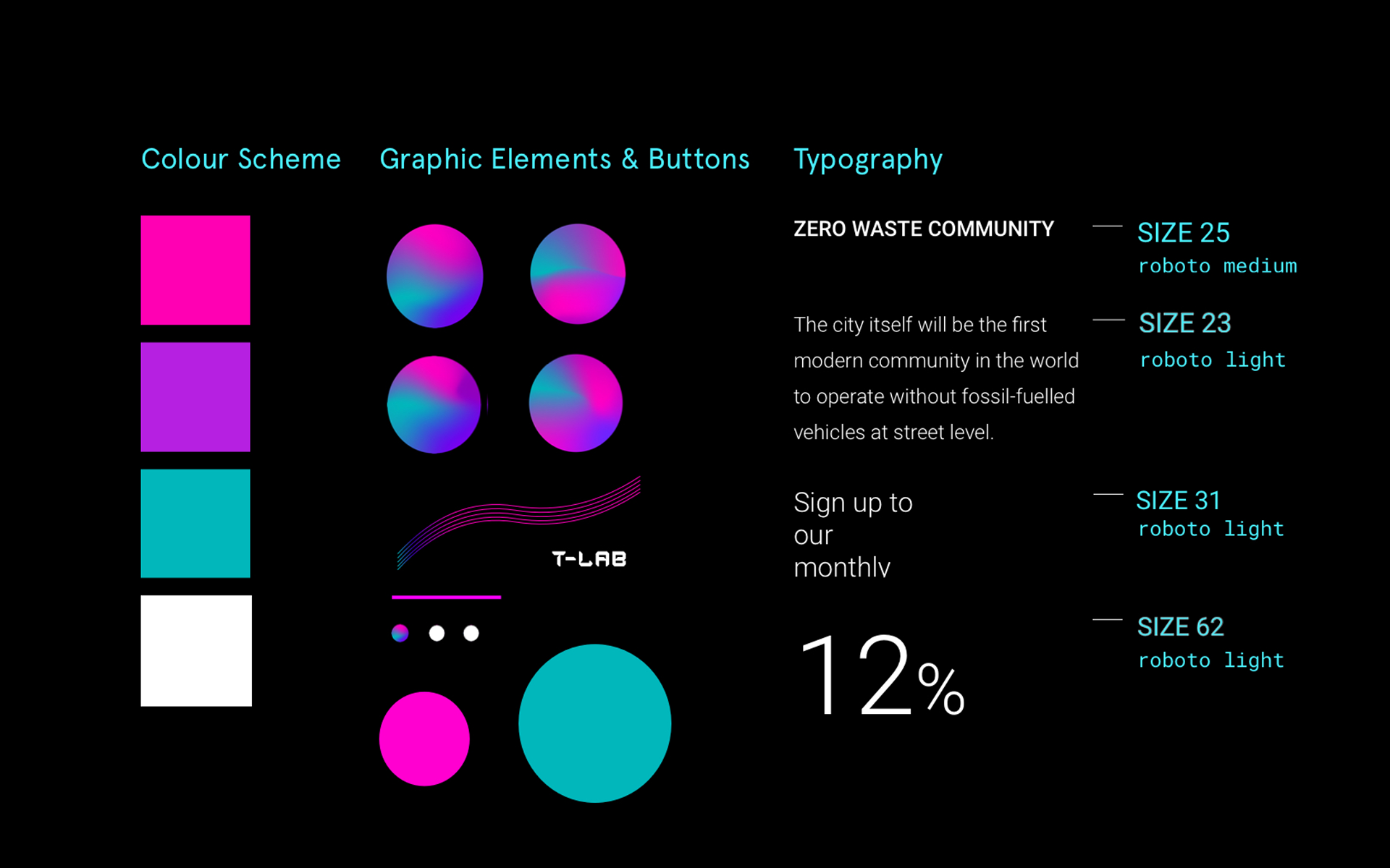
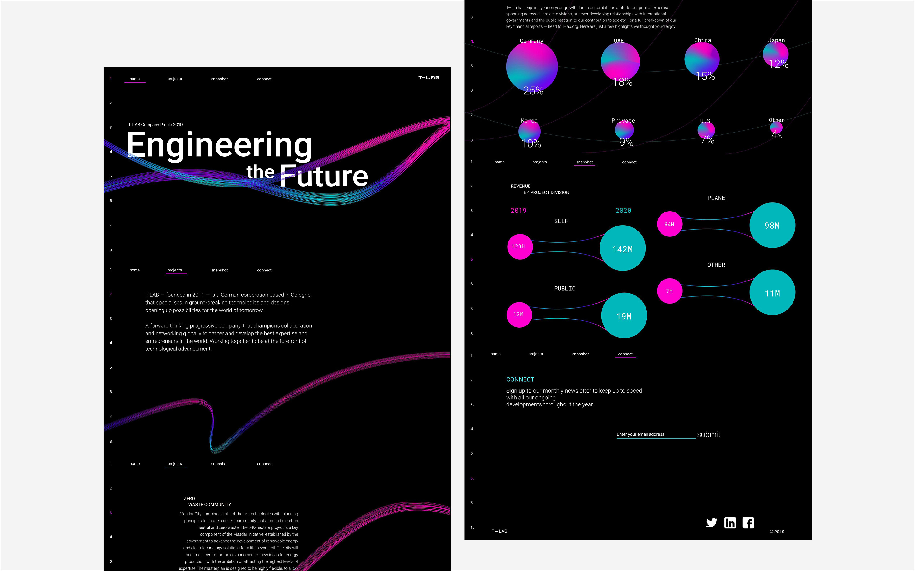
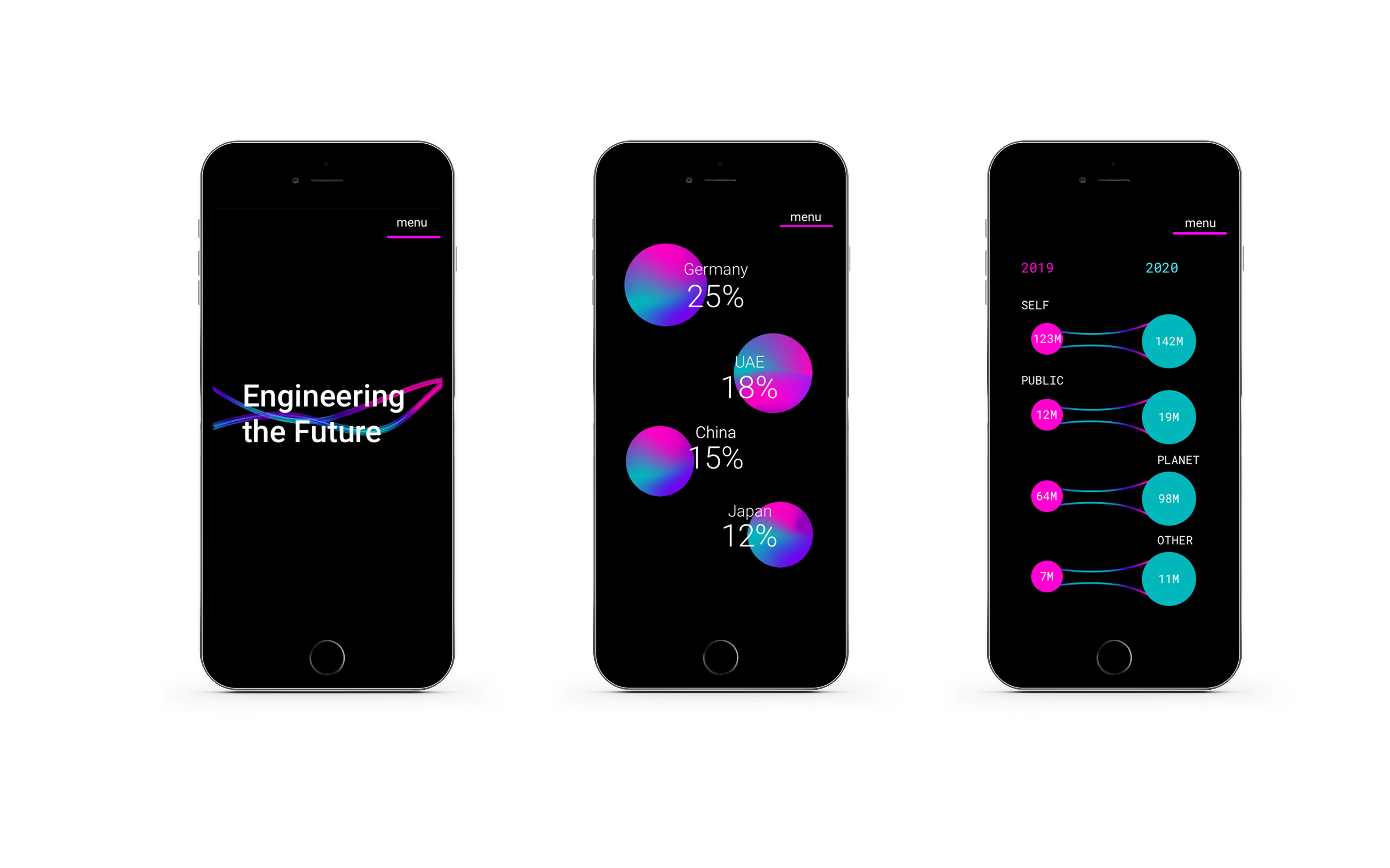
A corporate microsite showcasing the annual report of the tech company T-lab. I wanted the visuals of the website to reflect the corporate nature of the company, therefore I kept the overall colour scheme black. This had the added benefit of letting the colourful graphic elements take prominence.
To get inspiration for the visual language I looked at the project proposals themselves; a lot of the project proposals involve very fast movement, or flight. Flight can also symbolise human progress, so I wanted to translate these ideas into the design. This was where the swooshes and flowing lines came from. The colour scheme also feels space-like, which ties in with the themes of futurism and innovation.